While an emotional and psychological role of colours in business can be overestimated, the colours do have a direct impact on how visitors perceive your website (brand), even subconsciously.
The science behind colour theory is a career-building opportunity. However, there is a clear consensus when it comes to primary colours and the practical application of colours in business.
That’s how yellow is usually associated with optimism and youth, and green with growth and sustainability, for instance.
But, as colours have specific meanings, the colour choice can either make or break the deal. Changing a saturation of a colour can significantly change the overall perception of a brand.
Choosing the right colour scheme directly influence every aspect of building brand’s identity, determining the success of the final product.
Thus, there is always a question on how to choose the best scheme. While the web offers many great tutorials and resources, often one can get confused with too much choice.
We have selected five online colour resources that, if used properly, will help you to choose the right colour scheme.
Adobe Color CC (formerly Kuler)
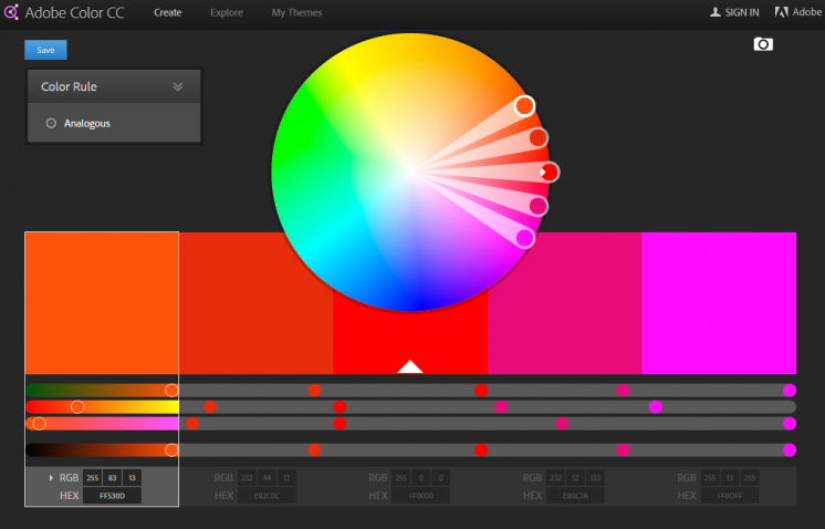
Adobe Color CC is a great tool to easily create colour pallets and sync them with other Adobe apps (Photoshop, Illustrator, Indesign).
The tool allows you to try out and save various colour schemes, experimenting with different colour variations and browsing through thousands of themes created by the Creative Cloud community.
Adobe Color CC uses themes comprised of five colours, govern by the different set of rules related to design principles (Analogous, Monochromatic, Complementary, Triad, Compound and Shades). However, you can also choose to create Custom themes, in whichever order you want.
The export codes are provided (including hexadecimal) under each colour, but the interface can be cumbersome at times. All in all, if you have a conventional understanding of the colour theory and concepts, this tools will help you to improve your skills.
Paletton
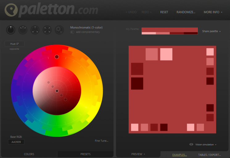
Paletton is certainly one of the most popular tools for picking a colour palette. The colour wheel is very manageable, simple and incredibly easy to navigate, a particularly useful tool for those who want to experiment with colour.
While it is a great tool for absolute beginners who know little about the colour theory, it doesn’t teach you why certain colours work well together. Nevertheless, its advanced options are especially useful, such as the ability to adjust an entire palette’s contrast and saturation.
When you select a colour scheme type, you can easily drag your selections around to explore new palettes, check for different kinds of colour blindness, and export in various formats.
Color by HailPixel
This handy web app is one of the simplest, yet extremely useful colour picking tools.
The tool uses an experimental algorithm that maps the Hue, Saturation, and Lightness values, giving you the hex code for your projects. If you are a perfectionist, you should try it.
Hover your mouse across the screen, and once you find a colour, save it with a single click (the colour gets set to the side). The tool works amazingly well due to its simplicity and ease of use. Moreover, all the colours you have previously selected remain visible.
COLOURlovers
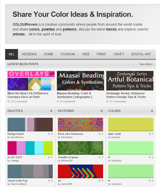
COLOURlovers is a community – a place to go to when you want to learn more about colour trends or if you are more interested in colour schemes. Artists and designers worldwide create and share colours, patterns, palettes. You can easily find great pallets for a specific context, for instance, fashion, or business, while you browse by category on the site.
It is an especially helpful community, and the website is well organised, and it features many useful tools.
The community also has an advanced colour palette tool, Copaso, that has all the basic features of the most colour wheel, but you can also publish colour palettes and generate a colour palette from an uploaded photo.
Pictaculous
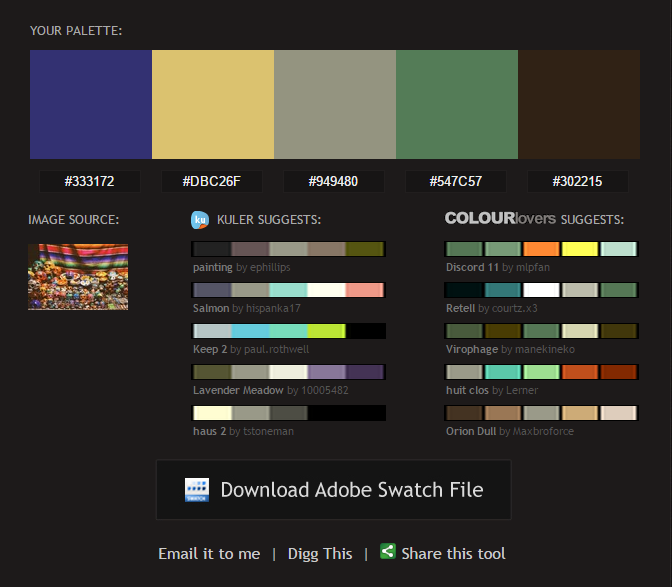
If you don’t want to pick your colours, Pictaculous can help you generate your desired colour scheme from images or photos. Once you upload an image, the tool creates a palette made out of colours extracted from the picture. This is probably the easiest way to create a functional design palette.
Moreover, Pictaculous will offer alternatives – it will give you colour scheme suggestions (five related colour palettes) from Kuler and COLOURlovers. You can use a colour code, or download it right into Adobe products.
Finally, if you want to learn more about how to create your colour palette, here is an excellent guide on colour theory for designers that explains everything you should know.
What online colour resource do you use?
Share with us in the comments.

