Do you remember how Google used to look like in 1998, or any other popular website back then? Probably only a few do.
How web design was before Drupal or Joomla for instance? How far web and graphic design has come to in the last decades is interesting to analyse.
Let’s see how the most popular websites and social networking have changed over the decades.
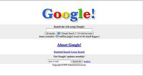
Google as a popular website in 90s
In 1998, Google was in beta (had an exclamation mark?), however, still very simple in comparison to web design of other popular websites.
Even then, Google offered users to choose how many results they want to show in the results, or to get Google updates.
The simplicity, as it appears, remained one of the most valuable qualities of the search engine. Although, today different search options are nicely included in the background, with more functionalities hidden on the page.
Yahoo
Yahoo! was certainly the king of the content, right? With a list of topics, sections such as What’s cool? or What’s popular?, Yahoo! underwent quite a change, though these sections still exist in a way.
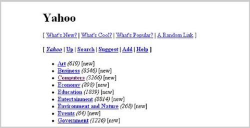
The most obvious change is that it used to be more focused on search queries, while today, it became an informational portal.
At least today it has more attractive search bars and buttons (I admit, I was never a fan of Yahoo!) calling out for people to engage in numerous ways.
Amazon
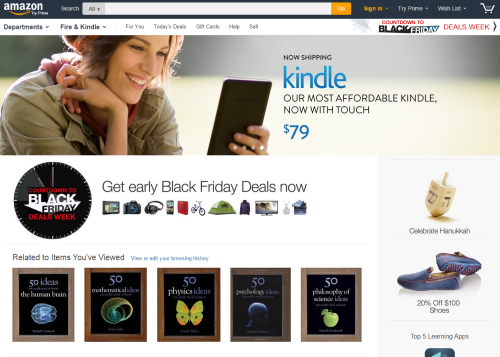
Amazon in 1995 was all about books, with a very clear message to visitors. Today, it’s one of the most predominant retailers. The web design, however, wasn’t appealing at all, although one was able to browse the database, read reviews, and see various categories.

Amazon today is simpler and organized, with a very clear message to users as well. Though, one might forget that message with so many images grabbing their attention. Amazon today is certainly communicating and selling differently.
YouTube
The first video on YouTube was uploaded on April 23 in 2005 called Me at the Zoo, a 19-second clip, and YouTube has come a long way since then.
One may notice that it lacked information, whereas, today, it offers categories, suggestions, lists, and more. As is expected from a video website, today, it tries to give the best experience for users.
We all have an idea of how Facebook became a network that it is today. Still, but when it comes to its web design, back in 2004, it had no photos, wall, a news feed, or pages whatsoever. It was limited only to Harvard students (in a march to Stanford, Columbia and Yale), and it reached only 1M users.
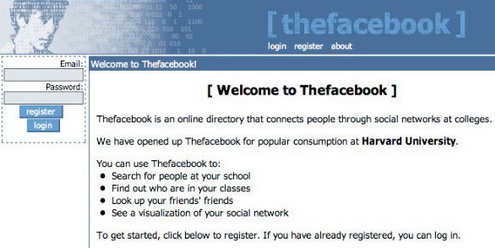
However, the sign-up page is quite similar in its functionality to the one today. Facebook today is more organized and cleaner in design.
Today Twitter’s newcomers no longer need an explanation on how to tweet. In 2006, when Twitter first went public, it was called Twttr, and the URL for the website was twttr.com.
Today, Twitter is simple and attractive, just like our Twitter for beginners guide that you should definitely check out.
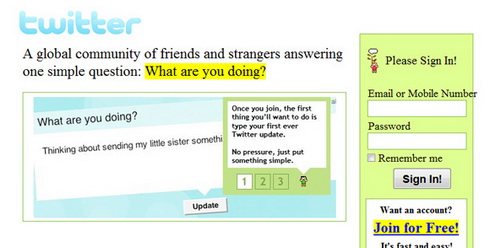
LinkedIn has probably come the longest way for a network, although it wasn’t so attractive when launched.
However, back in 2003, LinkedIn did provide good information in a relatively simple way, informing what you can do on the network and how.
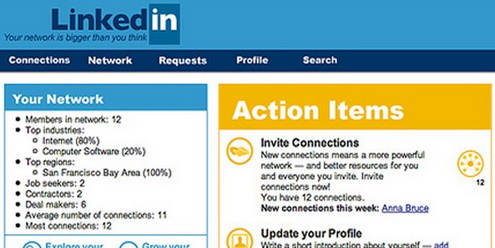
LinkedIn today has a clear message on why anyone should create an account, and it has grown into a platform of business professionals. As for the design, the difference is more than obvious.
Wired
In 1998, Wired magazine was text-based, with a weird color combination of red in the background and listing in light green.
However, for the text-based website, it had good organization. Today, Wired is even more organized, appealing and attractive.
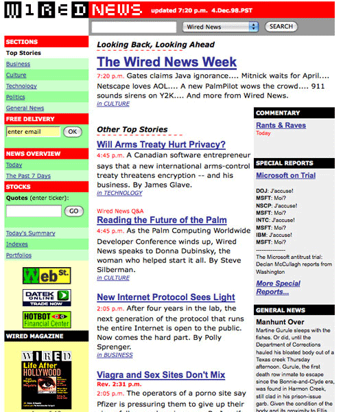
After these images, it’s needless to say how web design has changed, (thankfully). However, the difference doesn’t only concern design, we can see changes in communication, interaction, participation, and experience online. With design changes, we changed how we engage, work and live online.
Do you remember how the Internet looked like in 1995? Leave us your impressions in the comments below.

