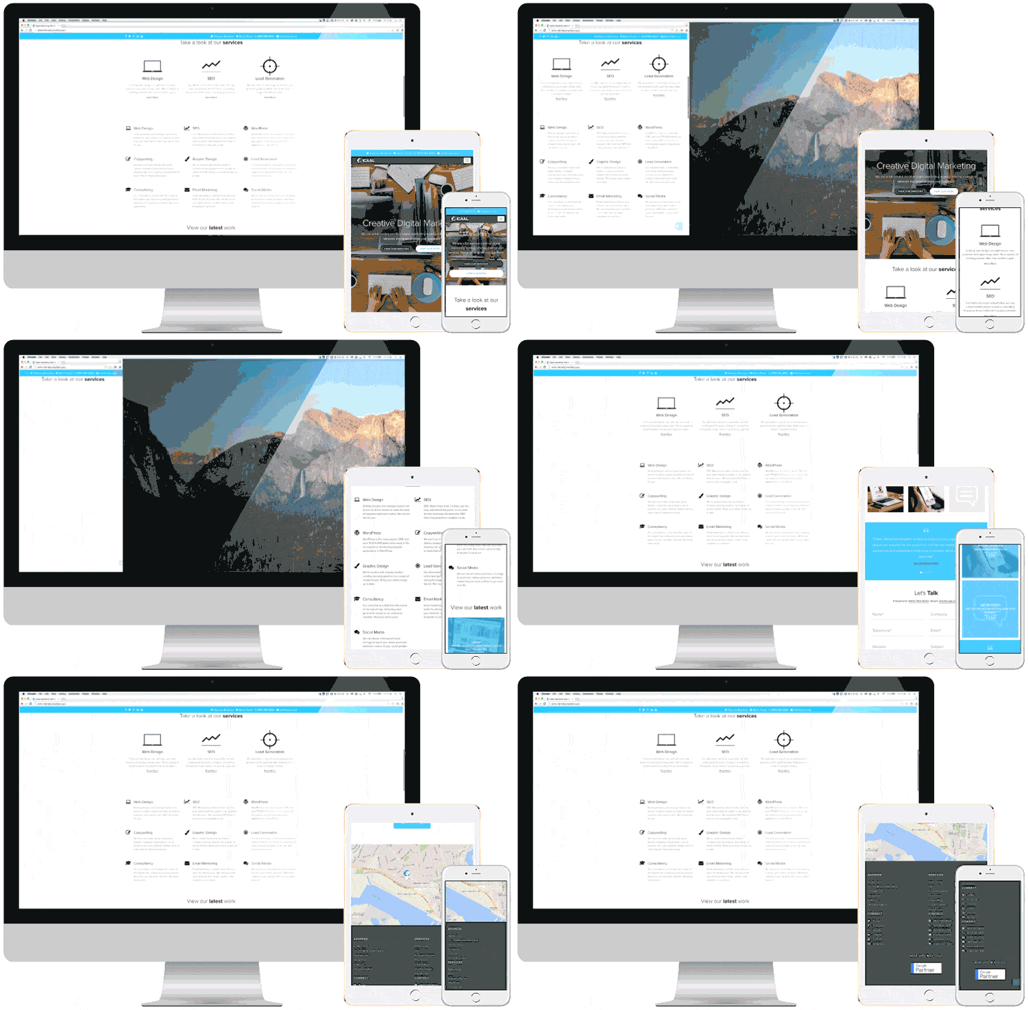
Today, responsive web design is something we apply without a question, but there was a time when web design responsiveness was a thing.
Back in 2014, Verge was yet another tech news site that went fully responsive, “no more mobile site, no tablet site, no desktop site – there is just one Verge for everything”.
The site became faster regardless of a device. Moreover, they took down the apps, and shut off the API. The result was considered as somehow a breakthrough for responsive design.
Of course, everyone soon realised how many benefits responsive web design is about to give.
What made web design responsiveness so wanted?
One of the answers might be the fact that users leave a website if it takes more than 3 seconds to load (in fact, 57 % will leave your website, as research showed).

“A one-second delay in page time equals a 7% loss in conversions, 11% fewer page views and a 16% decrease in customer satisfaction“.
Still, a fine-tuned and fully responsive web design can overturn this equation.
How?
When you think about the users, think conversion rate.
Responsive websites provide great user experience by adapting to screens automatically, presenting information in a format that is easy to browse across multiple devices.
When you don’t bother your users with zooming in or pinching their screens to see what your website has to offer, they will come back.
An increase in traffic and improved conversion rate is closely linked to better user experience, logically.
Usage of tablets and mobile devices in on the rise, and if you offer easy access to your content, you will increase traffic to your website.
Mobile growth is not decreasing; in fact, by 2023 it’s expected that:
- The number of devices connected to IP networks will be more than three times the global population by 2023.
- There will be 29.3 billion networked devices by 2023, up from 18.4 billion in 2018.
Responsive web design is a necessity for every e-commerce site.
Aberdeen Group conducted a study where they revealed that responsive websites were rewarded with a 10.9 percent increase in visitor to buyer conversion rates (non-responsive had only 2.7 percent increase).
Other brands also praise switch to responsive design as their best decision.
When it comes to search engine optimisation, responsive design has (still) a huge impact on it.
Google’s help page suggests that a single URL helps the search engine assign indexing properties of the content, while load time is reduced and no redirections are needed.
Apparently, having a single page makes it easier for everyone, including having one SEO strategy. A single page also improves monitoring, reporting, and analytics.
Responsive web design has both content and design in mind. Content has to fit into the design and vice versa, to flow from page to page in order to create a consistent experience.
Switching to responsive is however still ongoing
If you are thinking about website redesign, you should know why responsive web design is so good for you.
The first feature to consider before you decide to make the switch comes solely from the user experience point of view.
If users are what gets your business going (most of the time they are), a single URL page makes it easier for users to share and link content. This, in turn, will have a positive impact on your conversion rate.
Through HTML5 and CSS3 features (media queries or fluid grids for instance) content have optimal display across various screen sizes and types (from your iPhone to Mobile Safari or Chrome on your desktop) because each device knows how to apply different layouts rules.
Win with fully responsive design and development for your website
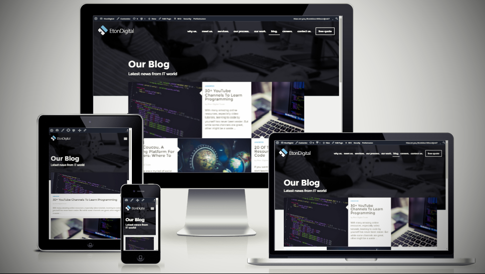
At Eton Digital, we have applied responsive web design techniques to different projects, focusing on providing a consistent experience.
Regardless of a device or screen size, a responsive design must meet the nees of the end-users, and this is what we strive to achieve.
These are some of our website design and development work.
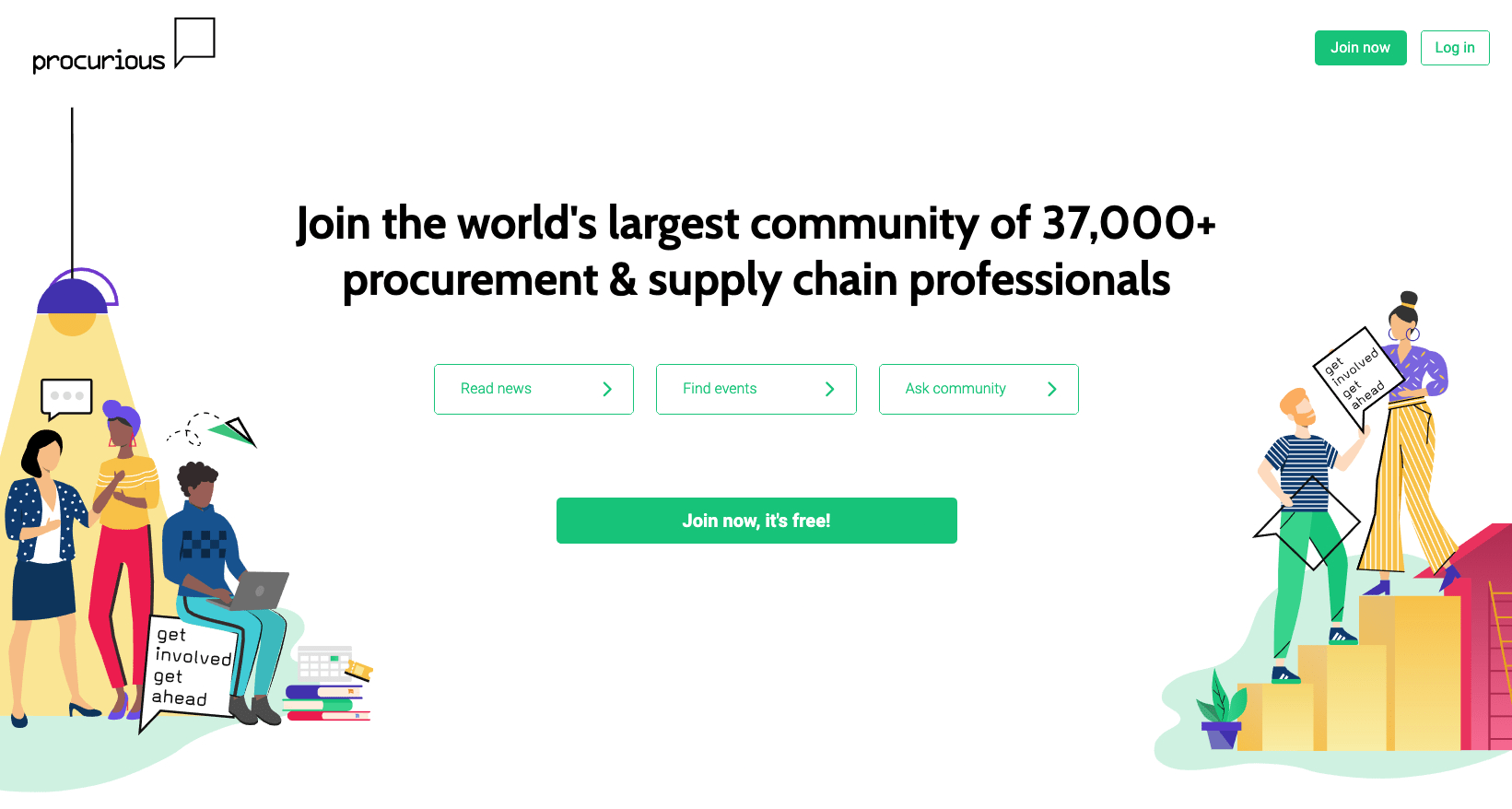
Procurious business network is built for a new generation of procurement professionals. It’s a hub for them to advance their career, develop skills and expand their professional network.

Established in 1977, Nissan Ireland is responsible for distributing the full range of Nissan new cars, commercial vehicles/vans and forklifts within the Republic of Ireland.
The fact that the major tech news website went responsive certainly gives more credentials to it.
We live in an “always online” era, so if you can save money and time while giving your users/followers/consumers the best experience, then why not choose one design for the website?


